Spring/Summer 2008, Volume 24.3
Art

Mark Biddle
Watching Your Language
Mark Biddle is a Utah educator and designer raised in the Midwestern U.S., where the cornfields meet the parking lots and questions of open space closed up long ago. He received an MFA from Indiana State University in 1981 and currently serves as co-coordinator of the program in Visual Communication in the Department of Visual Arts at Weber State University. See other visual art by Mark Biddle published in Weber.
Click here to see other art by Mark Biddle published in this issue of Weber.
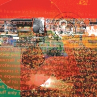
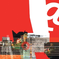
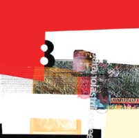
Untitled series from 1999,
36" x 36"
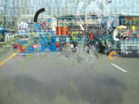
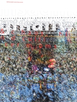
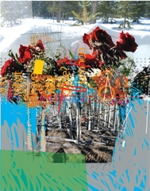
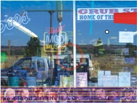
Shoot the beans—they happen to be on the heat, cooking. Many of the material elements for these recent digital assemblies are the most unlikely of the everyday—discarded ephemera—the ignored. Text messages take on an interesting new life when removed from their original contexts and woven together with threads of song lyrics or overheard bits of conversation. This recycle/rehab theme also applies to receipts, maps and diagrams drawn quickly by friends, and to photographs that didn’t turn out so well. Snowy television screens may hold value more for their flickering grain than for the ideas they’re supposed to represent. The transition zones of the well-trodden path are full of strange and unintelligible gems that beg to be re-considered. A word of wisdom from the Ancient East: "When the pupil is ready, the teacher will appear."
To be sure, there is referential value to some of the elements, but any attempt to glue it all together into a coherent narrative will likely fail. It’s more an assemblage of parts than a conceptual whole and has less to do with marking existence than with exploring the space of existence. Words and pictures collect into a small universe within the rectangle and form an argument—a chaos of political tension, ambiguity and surprising moments of lyrical harmony. All specific references must draw new alliances as they’re reshuffled into a vague and perplexing new context. And yet, all are linked as particulate matter in the life of this strange-looking bi-ped who stumbles around all day expanding and contracting, consuming and excreting.
The visual spaces are not built with overlapping planes or lines of perspective but as layers of shallow atmosphere. This may permit a seeing "into" or "through" as two worlds interface on the image surface much like a window pane permits both a reflection of the world on the near side of the glass and a glimpse through the glass to the world on its far side. I’m also drawn to other intersections such as graffiti on box cars where institutional signs meet the anarchic, although the formal distance between the two types of messages grows narrower when the graffiti becomes more graphically sophisticated.
Some of the texts are too difficult to read because the word spacing has been removed or the letters are breaking apart. I’m aware of this, although some have felt the need to point it out. Just take a step back and contemplate image, color and space all together as if it were the night sky. The visual elements never atomize into a total haze but often dissolve in that direction. Turner, Bierstadt and the expansiveness of the western U.S. landscape all influence this push. The ratty noise of daily living gets loud but seldom hits any notable peak. It’s exciting to crank up the cacophony.
Frank Lloyd Wright argued that spatial order is the salient quality in architecture. And, while form is most often asked to stand as venue for a concept, certain "spatial orders" may invite us to transcend the conceptual, which is bound by thought, and arrive on a more distant plane. Despite the shattering and fragmentation, seeking out a "spatial order" for each image is an important part of the process. I want to configure an organic atmosphere with enough order and energy to offer sustenance over time. We absorb pure form directly, without cognitive filtration, which bumps the experience towards the emotive. Intellection can sometimes interfere with the aesthetic.
[Click on pictures to enlarge.]
Back to Top

